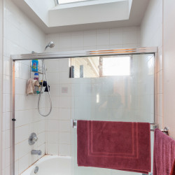
Originally, we thought we’d just replace or refinish the tub in their bathroom. The surface had worn and become very stained and the tile grout was icky making it hard to keep clean (or at least it never looked clean even when it had been cleaned!).
We were planning to demolish the master bathroom and remove the tub (which we never use). In reading about the pros and cons of doing this – largely from the point of view of selling the house; neither of us lives a life with time for long soaks in a tub – a couple of things became clear.
You need to have a tub in the home somewhere. Although some people will reject a house with a master bath with no tub, of those who are OK with that, anyone with small kids will need a bathtub. Kids are terrified of showers for a few years.
The reaction to the master bath by a prospective buyer should be “wow” not “there’s no tub in this bathroom”! After spending time figuring out what to do for the master bath, it became clear to me that seeing the uninspired 2nd bathroom at the top of the stairs, even if we fixed the tub and the grout, would definitely turn me off if I were buying this house again.

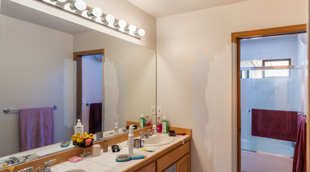
Standing in the room and thinking, I realized that a big problem with the room, like with so many in the house, is that it was shutting out natural light when it didn’t need to. There is a huge skylight over the tub, but with the old solid wall between the toilet/tub area and the sink/vanity, if you closed the pocket door in that wall during the day, you were in total darkness by the sinks.
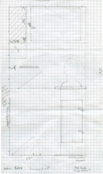
The first thought was just to make the wall frosted glass, but leave other things pretty much as they were, but you can’t put a pocket door into a glass wall, and so the process of drawing out options on graph paper.
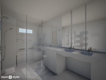
I found a free modeling program (Room Styler) to try and get a rough visual idea of what this would look like, and although it was pretty crude it did enough to help Jeffrey visualize what I wanted to do

There are lots of rules about placement of things – distance around a toilet, for example, so the designer for Westhill took what I did as a conceptual starting point and made it a plan that would work, meet code, etc.

I originally said “No tile!” because I hated the stained, icky grout in the old bathroom so much, but was persuaded that the newer urethane/epoxy grouts are so much better (and we were using gray, not white, which should hide any minor staining!).
I wanted a curbless, frameless shower – no more climbing into the tub, and space constraints meant that really had to be a wet room. The kids’ often complained about how cold the tile floors were on bare feet, so after checking on the costs, we decided to put an under floor heating system.
To top off the goodies, we added a heated towel bar. When we moved in, there weren’t any towel bars in the bathrooms, so I installed some and other than nagging at the kids to hang up the bath mat, have ignored that area completely ever since! Warm towels when you come out of the shower should be real luxury!
The paint splotches on the walls in the featured image are not the kids going insane, but me trying out paint samples as I figured out the color scheme. They did etch messages into the casing around the door, but that’ll get sanded and painted when its put back (and at 14 and 19 I hope they won’t be doing that sort of crap any more!)

