Oak!
Not entirely that, but a flyer from a realtor who sells a lot in our neighborhood mentioned that homes that had been updated – i.e. de-oaked – sold well. The house was built in 1993 with plans developed in the 1980s and it’s showing its age in all sorts of ways.
Some of it is wearing out and some of it was badly designed in the first place (does no one think about keeping things clean? are all builders cheapskates?).

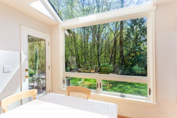
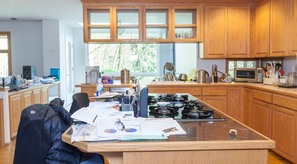
Like the rest of the house, the kitchen takes no account of how the house is situated on the lot – views of the woods and garden are obscured. A glass cabinet over the peninsula by the sink is the main thing you see when you walk in. There are two tiny glass block windows in the corner of the countertop. This is how things looked before the new skywall window
The cooktop in the island has a downdraft vent – these are 99.9% useless and don’t work to get cooking smells (and grease-laden warm air) out of the kitchen. Something sitting in the dining room for years had a layer of thick dusty grease on it – ick!
The pantry is small and has an odd (non-rectangular) shape. The door from the front hall is only 28-1/2” wide and getting large things (like the fridge) into the house in one piece is impossible. The fridge had to be taken apart to get it in when we moved from Texas.
The tile countertop is a nightmare to clean (grout) and the wooden edge is deteriorating. The built-in pastry marble surface is, and always was, a terrible idea – its raised edge is another cleaning horror show. The wooden “backsplash” and drywall above it is near-impossible to clean. Lower cabinets without drawers make the space hard to access – on your knees and bend your head to try and reach all the way in the back. Upper cabinets require a step stool for me to reach the top shelf or in the back.
The desk area is useless as a desk (you can’t put a chair in a walkway) and we need more storage there. Jeffrey’s “stuff” is all over the island as there’s no place else (in the kitchen) to put it where he can sit. The 27” wide oven is too narrow for some of my large pans.
There is a strange door on the hall that leads to the mud room (with a light switch hidden behind the door), a dark windowless hallway.
Other than that, everything’s fine 🙂
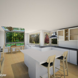
When I started trying to visualize what we should do and how to use the space, I put a plan together in Room Styler (a free room modeling program) and then used its render in Photoshop to create an idea of what we might be able to do:

Once you look at this alternative, every time the existing cabinets get in the way you notice them more. You start saying to yourself, “I never did like that xxxx…”!
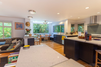
Edited in October to add a finished view to compare to the render above – fairly close as these things go! You can see the full Before/After here.


